As climate scientists we tend to look at the IPCC reports a little differently than the general public might. Here are a few things that mark this report out from previous versions that relate to issues we’ve discussed here before:
- Extreme events are increasingly connected to climate (duh!)
- Sea level rise is a big deal
- Use, abuse and misuse of the CMIP6 ensemble
- The radiative forcing bar chart has gone full circle
- Droughts and floods are complicated
- Don’t mention the hiatus
There are other things that will get the headlines (the expected time before we get to 1.5ºC or 2ºC, the headline SLR numbers, the ‘unprecedented rate’ statement, constraints on climate sensitivity, carbon cycle feedbacks, the implications for the carbon budgets etc.), and other things worth noting – for instance, the much better and more direct graphics that they have clearly worked on a lot. As usual, most of the headlines will also focus on the Summary For Policy Makers (SPM) which was approved word by word by the governments over the last two weeks (full disclosure, I was advising the US delegation), but the full report will be worth dipping into over the next few months (there is a lot there to digest!).
1. Extremes: Back in 2012, the literature assessed by AR5 connecting changes in extremes to climate change was scant. As we wrote at the time, attribution of single events was difficult and experimental. But as was exemplified by the recent reaction to the PNW heatwave, things have moved on considerably. This has allowed the IPCC authors to produce regional assessments of past changes in heat extremes, intense precipitation and agricultural/ecological drought in drying regions (see below for a discussion on what that means), and produce assessed projections of a whole suite of what they call Climate-impact Drivers (CIDs) – which includes floods, marine heatwaves etc. People who (even a couple of weeks ago) were quoting the AR5 statements on extremes as if that was current are going to have to update their talking points (that is, of course, if they care about correctly reflecting the most up-to-date science…).
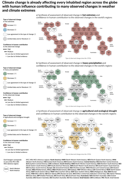 Figure SPM3.
For example, IPCC finds that Northern Europe, Western Central Europe and Eastern Europe all show an observed increase in heavy precipitation events, such as the one causing the recent massive flooding in Germany and Belgium. Western Central Europe is one of the few regions where both an increase in extreme precipitation and in drought have already been documented. The IPCC notes that it’s the most rare and severe extremes which are expected to show the biggest percentage increase in frequency (see this past RealClimate post).
2. Sea Level Rise: The previous IPCC reports, notably AR4 and AR5 (to a lesser extent), have had a hard time dealing with SLR. This has been due to multiple issues, including a historical lack of comprehensive literature to assess, very uncertain observations of ice sheets, and difficultlies in blending different lines of evidence. In this report they’ve tried much harder to put the data together more coherently, there is more evidence, and they haven’t shied away from being explicit about the low-likelihood/high-impact possibilities (mostly associated with a collapse of WAIS). Literally, the sea level projection runs off the page… (Stefan will have a more detailed assessment later).
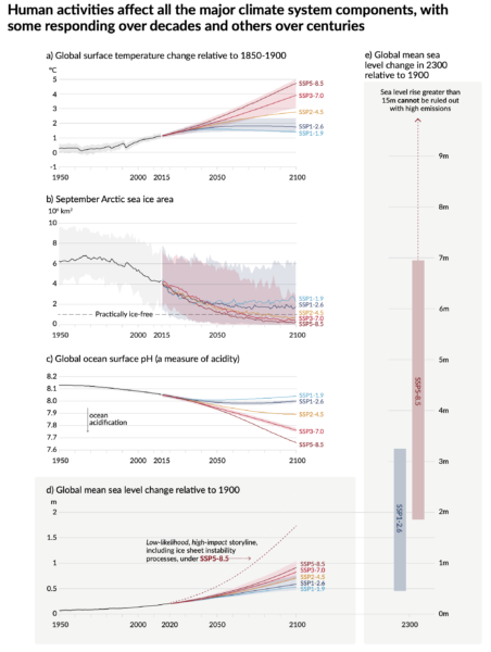 Figure SPM 8. Projections of (a) temperature (constrained), (b) Arctic sea ice area (raw CMIP6), (c) ocean pH (constrained), and sea level (d)to 2100, and (e) to 2300 (constrained).
3. Use, Abuse and Misuse of the CMIP6 ensemble: I’ll discuss this in more detail in another post, but I want to commend the IPCC authors for dealing with the increased spread in the CMIP6 ensemble climate sensitivity in two very sensible ways. Firstly, the use constrained projections for all the temperature (and sea level) time series out to 2100 allows them to downweight (effectively to zero) the high (and low) ECS models that are outside of the assessed range (note this would not have made much (if any) difference in CMIP5). Secondly, they choose to focus on the patterns of change, not for certain time-periods, but for specific “Global Warming Levels” (GWLs). That is to say, what the expected pattern of rainfall (for instance) might be when the global mean temperature reaches 1.5ºC, or 2ºC or 4ºC etc. This allows them to include all the models (including good models with improved climatologies that happen to have high ECS like the NCAR CESM2 or the HadGEM3 models). Additionally, the GWL impacts plots neatly divorce the limited scenarios that were used in CMIP6 from the ability to assess impacts. Thus if policy-makers or others want to explore the impacts of other scenarios that might reach specific warming levels earlier or later than any one of the SSPs, they can do so easily, without having to rerun the models.
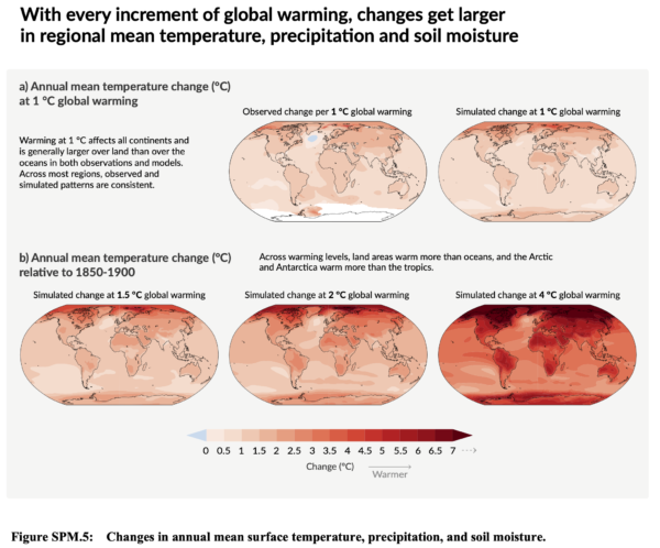
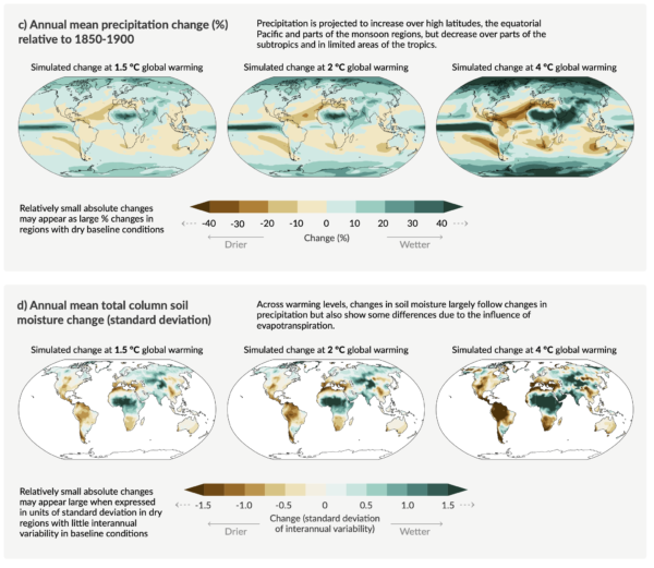 AR6 Figure SPM 5 showing the patterns of temperature, rainfall and soil moisture for specified global warming levels.
4. The radiative forcing bar chart has gone full circle: Almost every IPCC report has a version of the radiative bar chart showing the contributions over the historical period of all the different forcings (greenhouse gases, aerosols, solar, etc.). Every iteration has changed in trivial and sometimes substantive ways (I wrote a history of this a few years back), for instance, it’s oscillated from a vertical or horizontal presentation for no apparent reason, and the individual components have followed the scientific views of what was important. In this SPM it appears in Fig. SPM 2c and has gone back to being vertical. They have stuck with the contributions by emission (as opposed to concentration – something we pushed for last time), but the novelty here is that they are plotting the estimated temperature impact from each of the contributions (using the radiative forcing, the assessed climate sensitivity and an simple impulse-response model). Oddly enough this is most reminiscent of the very first bar chart that appeared in Hansen et al. (1981) which can be seen here.
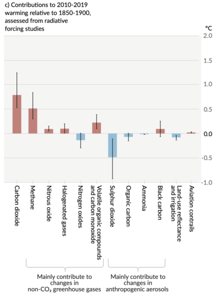 Fig SPM2b. The radiative forcing bar chart now converted to temperature.
5. Droughts and floods are complicated: The picture on droughts and floods is more complicated than most people think. First, there is a great deal of regional variation, second the historical metrics we use to assess drought (such as the Palmer Drought Severity Index) don’t perform very well in a changing climate, and third the attribution of meteorological or agricultural or ecological drought varies as well. Analyses that average over too wide an area, or that look at the wrong metrics, will come to erroneous conclusions. The IPCC authors went to a lot of trouble to disentangle this and the assessment in Fig. SPM3 of evidence for observed drought changes focuses specifically on agricultural and ecological drought (based on soil moisture), as opposed to hydrological drought (runoff) or meteorological drought (based on rainfall). This is because we don’t see strong attribution in total rainfall amounts, but we do in evaporative demand (which depends on temperature). Thus when we have a longterm precipitation anomaly (such as in the American South West (WNA in the hexagon plot above)), we can’t (yet) attribute the rainfall change, but we can attribute the soil moisture change. Floods are also complicated because they too don’t solely depend on a single factor (such as intense precipitation) – but instead are a function of prior state of soil moisture, water management practices and other hyper-local effects. Work here will continue to advance, but the picture is clear only in a few regions so far.
6. Don’t mention the hiatus: Readers will probably remember the prominence of the ‘hiatus’ in the discussions around the AR5 report (written in 2013) (see here, here, or here). Due in part to (IMO) an over-reliance on a single temperature record (HadCRUT4), and (it turns out) non-climatic biases in the ocean temperature records, the trends from 1998-2012 got a specific call out in the AR5 SPM:
In addition to robust multi-decadal warming, global mean surface temperature exhibits substantial decadal and interannual variability (see Figure SPM.1). Due to natural variability, trends based on short records are very sensitive to the beginning and end dates and do not in general reflect long-term climate trends. As one example, the rate of warming over the past 15 years (1998–2012; 0.05 [–0.05 to 0.15] °C per decade), which begins with a strong El Niño, is smaller than the rate calculated since 1951 (1951–2012; 0.12 [0.08 to 0.14] °C per decade)5. {2.4}
Section B.1, SPM AR5
The observed reduction in surface warming trend over the period 1998 to 2012 as compared to the period 1951 to 2012, is due in roughly equal measure to a reduced trend in radiative forcing and a cooling contribution from natural internal variability, which includes a possible redistribution of heat within the ocean (medium confidence). The reduced trend in radiative forcing is primarily due to volcanic eruptions and the timing of the downward phase of the 11-year solar cycle. However, there is low confidence in quantifying the role of changes in radiative forcing in causing the reduced warming trend. There is medium confidence that natural internal decadal variability causes to a substantial degree the difference between observations and the simulations; the latter are not expected to reproduce the timing of natural internal variability. There may also be a contribution from forcing inadequacies and, in some models, an overestimate of the response to increasing greenhouse gas and other anthropogenic forcing (dominated by the effects of aerosols). {9.4, Box 9.2, 10.3, Box 10.2, 11.3}
Section D.1, SPM, AR5
Now however, the updates to the historical warming, the use of four datasets instead of one, and of course, the series of record breaking years subsequently (2014, 2015, 2016/2020), the issue of variability in decadal trends is no longer so salient. The shifts in the quoted trends (1998-2012 is now 0.12ºC/decade, 1951-2012 is 0.13ºC, HadCRUT5) underlines the trivialness of the issue. To be fair, there is one mention of the hiatus in the AR6 Technical Summary:
The observed slower global surface temperature increase (relative to preceding and following periods) in the 1998–2012 period, sometimes referred to as ‘the hiatus’, was temporary (very high confidence). The increase in global surface temperature during the 1998–2012 period is also greater in the data sets used in the AR6 assessment than in those available at the time of AR5. Using these updated observational data sets and a like- for-like consistent comparison of simulated and observed global surface temperature, all observed estimates of the 1998–2012 trend lie within the very likely range of CMIP6 trends. Since 2012, global surface temperature has warmed strongly, with the past five years (2016–2020) being the hottest five-year period between 1850 and 2020 (high confidence). {2.3.1, 3.3.1, 3.5.1, Cross-Chapter Box 3.1}
AR6 Cross-Section Box TS.1
Let this episode stand as a clear reminder for assessment reports not to get ahead of the science…
And so to bed…
Finally, let me finish up with a couple of personal observations. This was the first IPCC report where I was involved in the SPM approval process, and while that was frustrating at times, the vast majority of delegates were obviously focussed on getting the best summary consistent with the science that they could. Obviously, some countries had specific sensitivities, but seeing the negotiations on how those issues could be finessed while sticking to language that the authors approved of was impressive. In particular, the chairing of the meeting by Valerie Masson-Delmotte was a masterclass in effective meeting strategies. The virtual nature of the proceedings means that this was undoubtedly the SPM approval session with the lowest carbon footprint which might serve as a model for future efforts. However, the ‘all time zone’ nature of the proceedings and the very interrupted nature of my resulting sleep patterns has left a mark on pretty much everyone involved. Forgive me if I sleep in for the rest of this week…
References
- J. Hansen, D. Johnson, A. Lacis, S. Lebedeff, P. Lee, D. Rind, and G. Russell, "Climate Impact of Increasing Atmospheric Carbon Dioxide", Science, vol. 213, pp. 957-966, 1981. http://dx.doi.org/10.1126/science.213.4511.957